
 作者:一名 Vue 的学习者
 记录时间:2025年12月
 目标:美化 首页 Dashboard,实现如下效果:
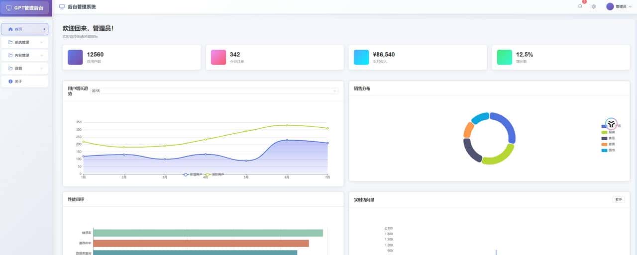
效果图
登录做完后来,我终于可以开始折腾后台系统最有 “成就感” 的部分了:首页 Dashboard。
一个后台系统没有首页总感觉缺了点东西,而一个首页没有图表,又像是“空骨架”。
这一篇主要做两件事:
✔ 把首页布局做得像个后台首页
✔ 引入 Echarts,做一个可互动的图表
让我的项目第一次 “动” 起来。
1. 首页应该长什么样?
我希望自己的首页有三块内容:
- 顶部的欢迎信息
- 几个简洁的统计卡片
- 一个或多个图表(Echarts)
- 后面可以继续加表格、公告、操作入口等等
先把基础结构写出来。
2. 创建 Home.vue 最终结构
我的目标页面是这样:
- 欢迎语
- 一排统计卡片
- 铺满整个页面的多个图表
来写代码。
Home.vue(完整布局)
<template>
  <div class="home-container">
    <!-- 页面标题 -->
    <div class="page-header">
      <h1>数据概览</h1>
      <p>实时监控系统关键指标</p>
    </div>

    <!-- 统计卡片 -->
    <div class="stats-cards">
      <el-row :gutter="20">
        <el-col :xs="24" :sm="12" :md="6" class="card-col">
          <div class="stat-card">
            <div class="stat-icon user-icon">
              <i class="el-icon-user"></i>
            </div>
            <div class="stat-content">
              <div class="stat-value">{{ stats.totalUsers }}</div>
              <div class="stat-label">总用户数</div>
            </div>
          </div>
        </el-col>
        <el-col :xs="24" :sm="12" :md="6" class="card-col">
          <div class="stat-card">
            <div class="stat-icon order-icon">
              <i class="el-icon-shopping-cart-2"></i>
            </div>
            <div class="stat-content">
              <div class="stat-value">{{ stats.todayOrders }}</div>
              <div class="stat-label">今日订单</div>
            </div>
          </div>
        </el-col>
        <el-col :xs="24" :sm="12" :md="6" class="card-col">
          <div class="stat-card">
            <div class="stat-icon revenue-icon">
              <i class="el-icon-money"></i>
            </div>
            <div class="stat-content">
              <div class="stat-value">¥{{ stats.revenue }}</div>
              <div class="stat-label">本月收入</div>
            </div>
          </div>
        </el-col>
        <el-col :xs="24" :sm="12" :md="6" class="card-col">
          <div class="stat-card">
            <div class="stat-icon growth-icon">
              <i class="el-icon-trend-chart"></i>
            </div>
            <div class="stat-content">
              <div class="stat-value">{{ stats.growthRate }}%</div>
              <div class="stat-label">增长率</div>
            </div>
          </div>
        </el-col>
      </el-row>
    </div>
    <!-- 图表区域 -->
    <div class="charts-section">
      <el-row :gutter="20">
        <!-- 用户增长折线图 -->
        <el-col :xs="24" :lg="12" class="chart-col">
          <el-card class="chart-card">
            <template #header>
              <div class="chart-header">
                <span>用户增长趋势</span>
                <el-select v-model="userTrendRange" size="small" @change="updateUserTrendChart">
                  <el-option label="近7天" value="7d"></el-option>
                  <el-option label="近30天" value="30d"></el-option>
                  <el-option label="近90天" value="90d"></el-option>
                </el-select>
              </div>
            </template>
            <div ref="userTrendChart" class="chart-container"></div>
          </el-card>
        </el-col>

        <!-- 销售饼图 -->
        <el-col :xs="24" :lg="12" class="chart-col">
          <el-card class="chart-card">
            <template #header>
              <div class="chart-header">
                <span>销售分布</span>
              </div>
            </template>
            <div ref="salesPieChart" class="chart-container"></div>
          </el-card>
        </el-col>

        <!-- 性能监控柱状图 -->
        <el-col :xs="24" :lg="12" class="chart-col">
          <el-card class="chart-card">
            <template #header>
              <div class="chart-header">
                <span>性能指标</span>
              </div>
            </template>
            <div ref="performanceChart" class="chart-container"></div>
          </el-card>
        </el-col>

        <!-- 实时数据面积图 -->
        <el-col :xs="24" :lg="12" class="chart-col">
          <el-card class="chart-card">
            <template #header>
              <div class="chart-header">
                <span>实时访问量</span>
                <el-button size="small" @click="toggleRealTime">
                  {{ isRealTimePaused ? '继续' : '暂停' }}
                </el-button>
              </div>
            </template>
            <div ref="realTimeChart" class="chart-container"></div>
          </el-card>
        </el-col>
      </el-row>
    </div>
  </div>
</template>

<script setup>
import { ref, onMounted, onUnmounted, nextTick } from 'vue'
import * as echarts from 'echarts'

// 响应式数据
const userTrendRange = ref('7d')
const isRealTimePaused = ref(false)

// 统计卡片数据
const stats = ref({
  totalUsers: 12560,
  todayOrders: 342,
  revenue: '86,540',
  growthRate: 12.5
})

// 图表DOM引用
const userTrendChart = ref(null)
const salesPieChart = ref(null)
const performanceChart = ref(null)
const realTimeChart = ref(null)

// 图表实例
let userTrendChartInstance = null
let salesPieChartInstance = null
let performanceChartInstance = null
let realTimeChartInstance = null

// 定时器
let realTimeTimer = null

onMounted(() => {
  nextTick(() => {
    initCharts()
    startRealTimeData()
  })
})

onUnmounted(() => {
  // 清理图表实例
  if (userTrendChartInstance) {
    userTrendChartInstance.dispose()
  }
  if (salesPieChartInstance) {
    salesPieChartInstance.dispose()
  }
  if (performanceChartInstance) {
    performanceChartInstance.dispose()
  }
  if (realTimeChartInstance) {
    realTimeChartInstance.dispose()
  }

  // 清理定时器
  if (realTimeTimer) {
    clearInterval(realTimeTimer)
  }
})

// 初始化所有图表
const initCharts = () => {
  initUserTrendChart()
  initSalesPieChart()
  initPerformanceChart()
  initRealTimeChart()
}

// 用户增长趋势图
const initUserTrendChart = () => {
  userTrendChartInstance = echarts.init(userTrendChart.value)
  const option = {
    tooltip: {
      trigger: 'axis'
    },
    legend: {
      data: ['新增用户', '活跃用户']
    },
    grid: {
      left: '3%',
      right: '4%',
      bottom: '3%',
      containLabel: true
    },
    xAxis: {
      type: 'category',
      boundaryGap: false,
      data: ['1月', '2月', '3月', '4月', '5月', '6月', '7月']
    },
    yAxis: {
      type: 'value'
    },
    series: [
      {
        name: '新增用户',
        type: 'line',
        smooth: true,
        data: [120, 132, 101, 134, 90, 230, 210],
        lineStyle: {
          width: 3
        },
        areaStyle: {
          color: new echarts.graphic.LinearGradient(0, 0, 0, 1, [
            { offset: 0, color: 'rgba(58,77,233,0.5)' },
            { offset: 1, color: 'rgba(58,77,233,0.1)' }
          ])
        }
      },
      {
        name: '活跃用户',
        type: 'line',
        smooth: true,
        data: [220, 182, 191, 234, 290, 330, 310],
        lineStyle: {
          width: 3
        }
      }
    ]
  }
  userTrendChartInstance.setOption(option)
}

// 销售分布饼图
const initSalesPieChart = () => {
  salesPieChartInstance = echarts.init(salesPieChart.value)
  const option = {
    tooltip: {
      trigger: 'item',
      formatter: '{a} <br/>{b}: {c} ({d}%)'
    },
    legend: {
      orient: 'vertical',
      right: 10,
      top: 'center',
      data: ['电子产品', '服装', '食品', '家居', '图书']
    },
    series: [
      {
        name: '销售分布',
        type: 'pie',
        radius: ['50%', '70%'],
        avoidLabelOverlap: false,
        itemStyle: {
          borderRadius: 10,
          borderColor: '#fff',
          borderWidth: 2
        },
        label: {
          show: false,
          position: 'center'
        },
        emphasis: {
          label: {
            show: true,
            fontSize: 18,
            fontWeight: 'bold'
          }
        },
        labelLine: {
          show: false
        },
        data: [
          { value: 335, name: '电子产品' },
          { value: 310, name: '服装' },
          { value: 234, name: '食品' },
          { value: 135, name: '家居' },
          { value: 154, name: '图书' }
        ]
      }
    ]
  }
  salesPieChartInstance.setOption(option)
}

// 性能指标柱状图
const initPerformanceChart = () => {
  performanceChartInstance = echarts.init(performanceChart.value)
  const option = {
    tooltip: {
      trigger: 'axis',
      axisPointer: {
        type: 'shadow'
      }
    },
    grid: {
      left: '3%',
      right: '4%',
      bottom: '3%',
      containLabel: true
    },
    xAxis: {
      type: 'value',
      boundaryGap: [0, 0.01]
    },
    yAxis: {
      type: 'category',
      data: ['页面加载', 'API响应', '数据库查询', '缓存命中', '错误率']
    },
    series: [
      {
        name: '性能指标',
        type: 'bar',
        data: [89, 95, 87, 92, 98],
        itemStyle: {
          color: function(params) {
            const colorList = ['#c23531','#2f4554', '#61a0a8', '#d48265', '#91c7ae']
            return colorList[params.dataIndex]
          }
        }
      }
    ]
  }
  performanceChartInstance.setOption(option)
}

// 实时数据面积图
const initRealTimeChart = () => {
  realTimeChartInstance = echarts.init(realTimeChart.value)

  let base = +new Date()
  let data = []

  for (let i = 1; i < 50; i++) {
    const now = new Date(base += 1000)
    data.push({
      name: now.toString(),
      value: [
        [now.getFullYear(), now.getMonth() + 1, now.getDate()].join('/'),
        Math.round(Math.random() * 1000)
      ]
    })
  }

  const option = {
    tooltip: {
      trigger: 'axis',
      formatter: function (params) {
        params = params[0]
        return params.value[0] + ' : ' + params.value[1]
      },
      axisPointer: {
        animation: false
      }
    },
    xAxis: {
      type: 'time',
      splitLine: {
        show: false
      }
    },
    yAxis: {
      type: 'value',
      boundaryGap: [0, '100%'],
      splitLine: {
        show: false
      }
    },
    series: [{
      name: '模拟数据',
      type: 'line',
      showSymbol: false,
      hoverAnimation: false,
      data: data
    }]
  }

  realTimeChartInstance.setOption(option)
}

// 开始实时数据更新
const startRealTimeData = () => {
  realTimeTimer = setInterval(() => {
    if (!isRealTimePaused.value && realTimeChartInstance) {
      const oldData = realTimeChartInstance.getOption().series[0].data
      const now = new Date()
      const newData = {
        name: now.toString(),
        value: [
          [now.getFullYear(), now.getMonth() + 1, now.getDate()].join('/'),
          Math.round(Math.random() * 1000)
        ]
      }

      // 保持数据长度,移除第一个数据点
      oldData.shift()
      oldData.push(newData)

      realTimeChartInstance.setOption({
        series: [{
          data: oldData
        }]
      })
    }
  }, 1000)
}

// 切换实时数据暂停/继续
const toggleRealTime = () => {
  isRealTimePaused.value = !isRealTimePaused.value
}

// 更新用户趋势图表
const updateUserTrendChart = () => {
  // 这里可以根据选择的时间范围重新获取数据
  console.log('更新图表数据,时间范围:', userTrendRange.value)
}

// 窗口大小变化时重绘图表
window.addEventListener('resize', () => {
  userTrendChartInstance?.resize()
  salesPieChartInstance?.resize()
  performanceChartInstance?.resize()
  realTimeChartInstance?.resize()
})
</script>

<style scoped>
.home-container {
  padding: 20px;
  background-color: #f5f7fa;
  min-height: calc(100vh - 84px);
}

.page-header {
  margin-bottom: 24px;
}

.page-header h1 {
  margin: 0 0 8px 0;
  font-size: 24px;
  color: #303133;
}

.page-header p {
  margin: 0;
  color: #909399;
  font-size: 14px;
}

.stats-cards {
  margin-bottom: 24px;
}

.card-col {
  margin-bottom: 20px;
}

.stat-card {
  background: white;
  border-radius: 8px;
  padding: 20px;
  box-shadow: 0 2px 12px 0 rgba(0, 0, 0, 0.1);
  display: flex;
  align-items: center;
  transition: transform 0.3s ease;
}

.stat-card:hover {
  transform: translateY(-5px);
}

.stat-icon {
  width: 60px;
  height: 60px;
  border-radius: 8px;
  display: flex;
  align-items: center;
  justify-content: center;
  margin-right: 16px;
  font-size: 24px;
  color: white;
}

.user-icon { background: linear-gradient(135deg, #667eea 0%, #764ba2 100%); }
.order-icon { background: linear-gradient(135deg, #f093fb 0%, #f5576c 100%); }
.revenue-icon { background: linear-gradient(135deg, #4facfe 0%, #00f2fe 100%); }
.growth-icon { background: linear-gradient(135deg, #43e97b 0%, #38f9d7 100%); }

.stat-value {
  font-size: 24px;
  font-weight: bold;
  color: #303133;
  margin-bottom: 4px;
}

.stat-label {
  font-size: 14px;
  color: #909399;
}

.charts-section {
  margin-top: 24px;
}

.chart-col {
  margin-bottom: 20px;
}

.chart-card {
  border-radius: 8px;
  box-shadow: 0 2px 12px 0 rgba(0, 0, 0, 0.1);
}

.chart-header {
  display: flex;
  justify-content: space-between;
  align-items: center;
  font-weight: 600;
  color: #303133;
}

.chart-container {
  height: 300px;
  width: 100%;
}

/* 响应式设计 */
@media (max-width: 768px) {
  .home-container {
    padding: 12px;
  }

  .stat-card {
    padding: 16px;
  }

  .stat-icon {
    width: 50px;
    height: 50px;
    font-size: 20px;
  }

  .stat-value {
    font-size: 20px;
  }

  .chart-container {
    height: 250px;
  }
}
</style>
3. 引入 Echarts(最重大的步骤)
在项目根目录安装:
npm install echarts在 Home.vue 里已使用:
import * as echarts from "echarts";使用el-row 、el-col、el-card来做页面布局
<el-row :gutter="20">
    <el-col :xs="24" :lg="12" class="chart-col">
      <el-card class="chart-card">
      </el-card>
    </el-col>
</el-row>
然后把图表绑定到:
<div ref="chartRef" class="chart"></div>这种方式超级稳定,也是 Vue 项目里使用 Echarts 的最简方式。
4. 图表数据未来怎么扩展?
我目前只是写死了数据,先把结构搭好,后续我会接 axios 后端接口:
- 请求后端真实统计数据
- 动态更新折线图
- 做更多图表(饼图、柱状图、仪表盘等)
5. 首页布局做法说明(为什么这样拆?)
记录一下我的设计思路:
✔顶部欢迎区:情绪化 + 不占空间
后台首页太冷冰冰,我想加一点欢迎语,让界面“活”一点。
✔统计卡片:后台系统标配
每个后台首页几乎都有这类小卡片,只是展示不同的维度:
访问量、新增用户、订单数等。
✔图表区域:最吸引注意力
在后台,大部分用户打开首页就是为了看趋势趋势趋势!
所以我用了一张折线图:
- 美观程度不错
- 容易理解
- 后续可替换为后端真实数据
✔结构保持极简
页面是可以不断加内容的,我刻意保持:
- 卡片不太大
- 图表独立一块
- 不使用 UI 库(保持原生简单)
将来你想集成 Element Plus,美化会更容易。
6. 小结
这一篇做完,我的后台首页终于“像个后台”了:
- 有欢迎区
- 有统计数字
- 有动态图表
- 有基础布局结构
- 未来可以无限扩展
而 Echarts 的初步使用,也为之后的「数据可视化」打下基础。
下一步计划:Axios使用与全局封装© 版权声明
文章版权归作者所有,未经允许请勿转载。
相关文章


暂无评论...